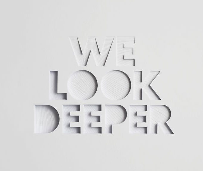
Type on websites is often overlooked, but boy if done right, can have an attention-grabbing effect. We have worked on hundreds, if not thousands of websites and the ones that stand out are the websites where the type has been a focus point. Well-spaced and set typography must be thought through and needs to work well with the layout, design and visuals to create the full impact it is capable of on your website.
TYPOGRAPHY IS LIKE BODY LANGUAGE
Just like body language often makes the first impression, Typography works in the exact same way. Good typography will enhance character and add tone to your website. Subliminally reinforcing what the content says as well as how users may perceive it. How is this important you may ask? The proof is in the research. Based on these findings by ConversionXL studies show that most people read around 20% of the text on a web page. According to the data the more we write on our web pages the less people want to read it.

FINDING THE PERFECT BALANCE
Based on the above do we need to present much shorter content? Not necessarily. With longer content sections, the information needs to stay relevant. For example an eCommerce product with a lot of page links and content tends to perform better among users as appose to simpler bodies of content. This is where readability and comprehension come into play. Size of Type, Line Spacing & taking into account the Demographic of your reader are all huge factors to the success of the content on your website.
With the introduction of Google Fonts in 2010 designers and developers have no excuses. We have ample access to beautiful typography, compatible for web use. Give attention to your website’s typography and your website will get more attention.


