What is UI/UX Design?
When you hear someone say “UX,” “UI,” or worse, “UI/UX” like it’s one mysterious blur, your first instinct might be to nod politely and move on. But if you’ve ever rage-quit an app, felt totally lost on a website, or thought “wow, that was smooth” while shopping online, congrats: you’ve already experienced both.
UI/UX design is the not-so-secret sauce behind digital experiences that work. It’s what turns a website from a layout into a journey. A form into a flow. A product into a pleasure to use.
At Dynamite, we don’t treat UI/UX as extras that are tacked on at the end. We see them as foundational elements, baked in from the beginning. When your digital presence feels effortless, intuitive and joyful, that’s no accident. That’s great design in action.
UI vs UX: What’s the Difference?
Let’s clear this up once and for all:
- UI (User Interface) is what things look like. Think buttons, fonts, colours, icons, animations, layout, responsiveness.
- UX (User Experience) is how it feels to use: how easy it is to navigate, how fast it responds, how clearly it communicates.
Here’s the metaphor we like to use with clients:
- UX is booking a flight, boarding, and landing without stress.
- UI is the cabin lighting, the wayfinding signage, the seat layout and how nice the tray table looks.
UX gets you there smoothly. UI makes the journey enjoyable.
They’re distinct, but deeply connected. Without UX, a UI is just decoration. Without UI, UX has no surface to live on. When they work together, you don’t just get a “nice” website. You get a great experience.
Why UI/UX Design Matters
Here’s the bottom line: if people don’t enjoy using your site or app, they’ll leave.
If they can’t figure it out? They’ll leave faster. And if your competitors are easier to use, guess where your customers will end up?
Exceptional UI/UX design:
- Makes your brand look sharp and professional
- Builds trust through ease and consistency
- Improves conversions by removing friction
- Makes users feel seen, understood, and in control
Consider this:
- A confusing button costs you sales.
- A glitchy form loses you leads.
- A frustrating checkout kills your revenue.
A joyful, seamless interaction? That builds loyalty. In fact, 88% of users are less likely to return to a site after a bad experience. That’s the real-world cost of bad UX.
But here’s the flip side: invest in great UX/UI, and you’ll start to notice higher engagement, longer dwell time, fewer support queries, and more word-of-mouth referrals. Because when a user feels like your product was made for them, they come back. And they bring people with them.
Where UI/UX Fits in the Bigger Picture
UI/UX design isn’t just about making pretty buttons or clean flows. It sits right at the intersection of:
- Web design (visual branding and layout)
- Web development (building the digital product)
- User psychology (understanding how people think and behave)
At Dynamite, we approach UI/UX as part of an integrated system. Every design decision – from font size to form structure – plays a role in shaping how people experience your brand.
UI/UX is the glue between intention and interaction. It connects your business goals to human behaviour and is what ensures that the digital translation works for both sides.
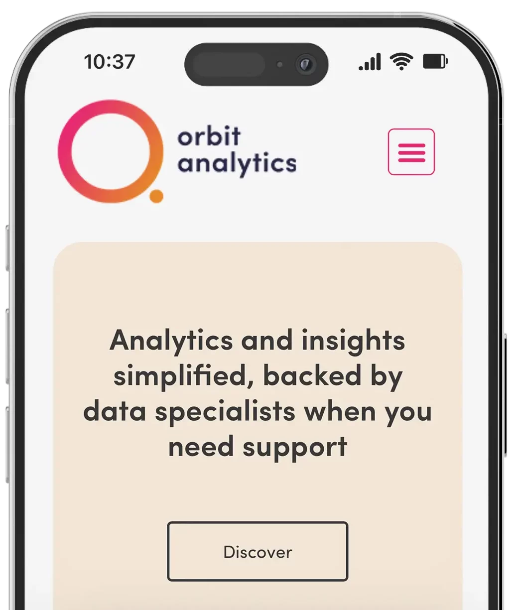
![]()
Core Components of UI/UX Design
Every project is different, but here’s what a strong UI/UX process usually includes:
1. User Research
This is where it starts: getting under the hood of your audience.
What do they need? What frustrates them? What motivates them to take action?
What to look at:
- Analytics and behavioural patterns
- Heatmaps and user journeys
- Interviews, feedback, and testing sessions
Because if you’re not designing for your user, who are you designing for? Too many brands start with assumptions. Great UX starts with evidence.
2. User Flow Mapping
User flows are the “choose your own adventure” maps of your website or app.
They show the paths users take to complete specific goals, whether that’s signing up, buying, booking, or exploring. Smooth user flows = fewer clicks, more clarity, better results.
What to prioritise:
- Logical steps
- Fewer dead-ends
- Clear calls to action
- A sense of progress
If your users feel like they’re guessing at the next step, that’s not an experience, it’s a puzzle. And puzzles don’t convert.
3. Wireframes
Before anything gets visually designed, we create wireframes. Think of them as skeletal outlines of each screen or page. Wireframes focus on structure, hierarchy, and layout logic without getting caught up in colour or style.
Use wireframes to:
- Spot redundancies early
- Align teams on layout direction
- Build a solid UX before moving into UI
They also help reduce “design by committee” syndrome — keeping feedback focused on flow, not fonts.
4. User Interface Design (UI)
Once the wireframes are approved, we add the visual elements. Things like colour palette, typography, spacing, imagery, icons, buttons, motion, and more.
Great UI does more than “look good.” It:
- Reinforces your brand identity
- Guides attention to the right places
- Makes using your product enjoyable and on-brand
This is where aesthetic meets intention. The goal isn’t just to impress, it’s to support clarity, usability, and delight.
5. Prototyping and Usability Testing
We turn our designs into clickable prototypes so we can test, tweak, and refine in real-time. This is where we catch:
- Confusing moments
- Frustrating patterns
- Design flaws that users won’t tolerate
Testing helps remove friction before your users ever feel it. And we don’t just test once. Iteration is part of the process. Because every brand evolves, and your digital experience should evolve with it.

What Makes UI/UX Design “Good”?
Here’s how you know when UI/UX design is working:
- It’s intuitive: users never feel lost or confused
- It’s accessible: usable by everyone, including those with impairments
- It’s consistent: styling, spacing, interactions all align
- It’s fast: no lag, no frustration
- It’s invisible: it gets out of the way so users can get things done
- It’s emotionally intelligent: it anticipates user moods and responses
Good UX doesn’t make you stop and think. It makes you keep moving, confidently.
So… Is UI/UX the Same as Web Design?
Not quite. They’re cousins, not twins. Web design often refers to the overall aesthetic and structure of a website, whereas UI/UX design zooms in on the interactions and experience inside that structure.
Think of web design as the blueprint and UI/UX as the experience of moving through the house. One can exist without the other, but together? They build something unforgettable.
Our Approach to UI/UX
We don’t just slap on design. We build experiences with purpose.
When you work with Dynamite, you get:
- Collaborative planning with your team (not just handovers)
- User-first decisions rooted in real behaviour
- Brand-led visuals that feel recognisable and memorable
- Scalable logic that grows with your platform
We design experiences that:
- Guide users where they need to go
- Reflect your brand’s energy and purpose
- Build real connection, not just clicks
We believe great UX/UI isn’t a “feature.” It’s a competitive edge.
Final Thoughts
UI/UX design is more than good looks and logical steps. It’s about how people feel when they use your product, and whether they want to come back. If your digital experience frustrates your users, confuses them, or makes them feel like just another click, that’s a lost opportunity.
But if it’s crafted with care? If it’s fast, human, clear, and delightful?
You win. Every time.
Ready to give your users something better? Let’s design something unforgettable together.