A clear light bulb with a gradient background to give it a shadow effect.
A light bulb with a filament with a gradient background to give it a shadow effect.
A clear light bulb with a gradient background to give it a shadow effect.
A light bulb with a filament with a gradient background to give it a shadow effect.

Stay Up To Date With The Latest News From Dynamite

UI/UX

What is UI/UX Design?

What is UI/UX Design? When you hear someone say “UX,” “UI,” or worse, “UI/UX” like it’s one mysterious blur, your first instinct might be to nod politely and move on. But if you’ve ever rage-quit an app, felt totally lost on a website, or thought “wow, that was smooth” while shopping online, congrats: you’ve already experienced both.   UI/UX design is the not-so-secret sauce behind digital experiences that work. It’s what turns a website from a layout into a journey. A form into a flow. A product into a pleasure to use.   At Dynamite, we don’t treat UI/UX as extras that are tacked on at the end. We see them as foundational elements, baked in from the beginning. When your digital presence feels effortless, intuitive and joyful, that’s no accident. That’s great design in action.   UI vs UX: What’s the Difference? Let’s clear this up once and for all: UI (User Interface) is what things look like. Think buttons, fonts, colours, icons, animations, layout, responsiveness. UX (User Experience) is how it feels to use: how easy it is to navigate, how fast it responds, how clearly it communicates.   Here’s the metaphor we like to use with clients:

Continue reading...

Client: Orbit Analytics
Year: 2022
Deliverables: Creative Direction, Branding, UX, Web Development

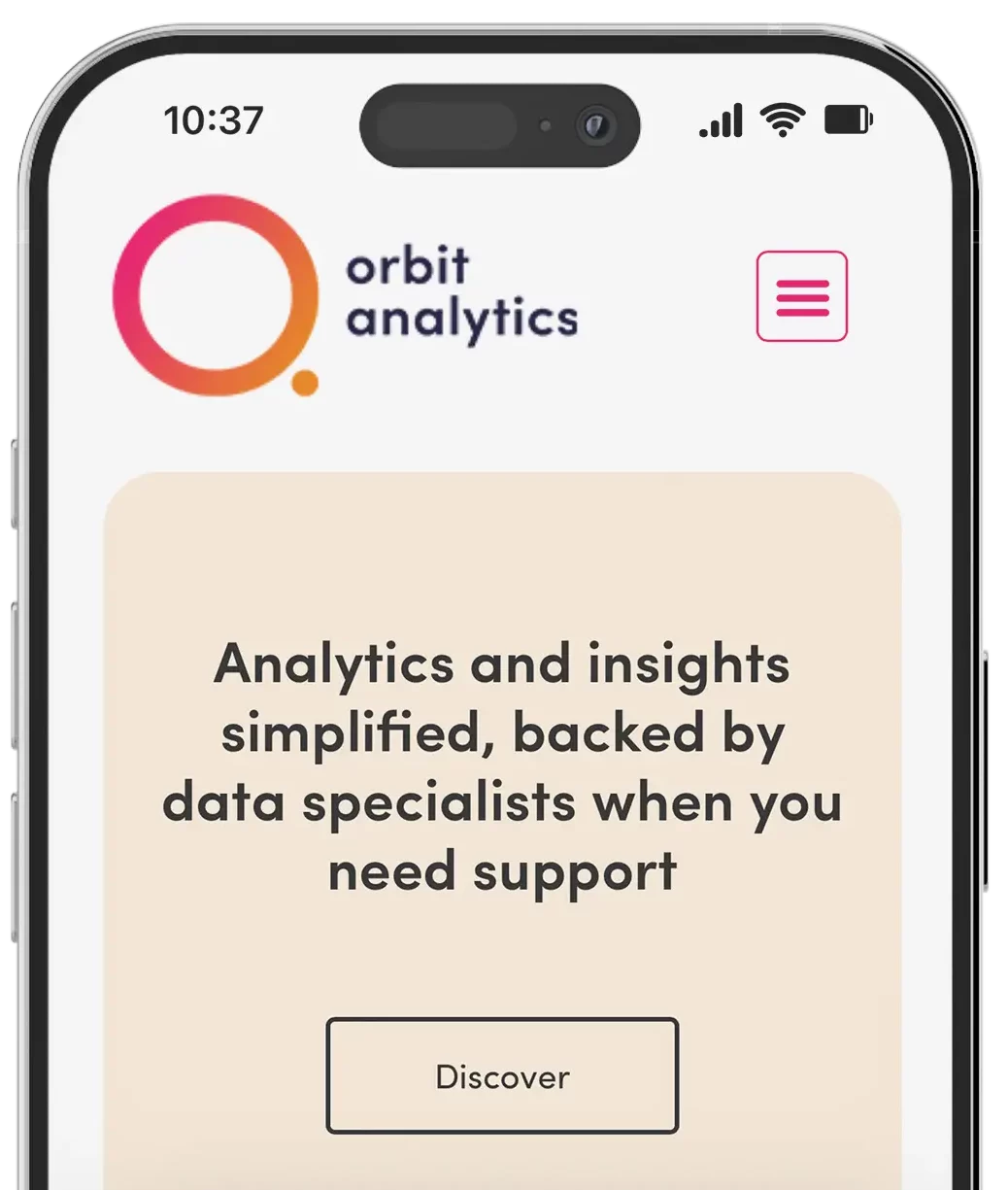
We partnered with Orbit Analytics to create a brand and platform that makes data approachable, friendly, and fun. Centered around accessibility and ease of use, we crafted a modern brand identity featuring a clever orbit-inspired logo, soft typography, and a bold, vibrant colour palette that breaks from traditional analytics aesthetics.

From visual identity to platform UX, every element was designed to reduce complexity and encourage user engagement. The website and dashboard offer a clean, intuitive experience, simplifying the way users interact with data while reinforcing Orbit’s mission: to bring people and data together through design that feels human.

A phone mockup of the way one of our website clients Orbit Analytics displays on mobile.