Orbit Analytics is a company that revolves around the core value of bringing people and data together on a user-friendly platform. With a focus on being friendly, approachable, and non-intimidating, the brand essence of Orbit Analytics was centred around simplicity, ease of use, and a welcoming experience. In designing the brand identity, we aimed to create a visual language that conveys the platform’s accessibility and user-friendliness, while maintaining a sense of modernity and reliability.
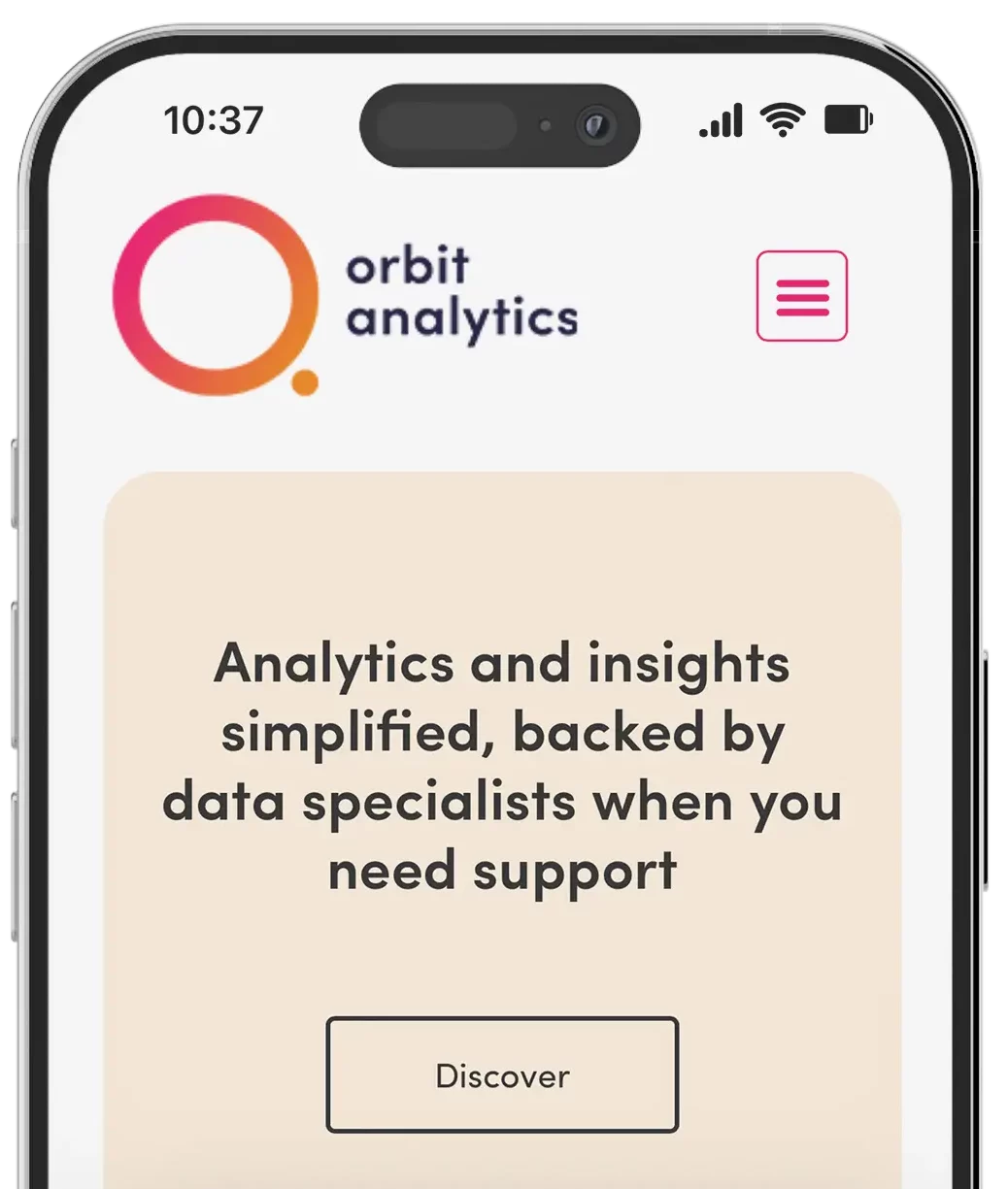
Our aim was to create a welcoming logo that effectively conveyed the platform’s ease of understanding and use. To achieve this, we took inspiration from the concept of orbits and utilised two circles strategically positioned to form the ‘O’ in Orbit and the ‘A’ in Analytics. This clever design not only represented the brand name but also mirrored the Earth’s orbit around the sun. Additionally, we employed a modern, clean, and soft typeface to imbue the logo with a friendly and approachable feel. The incorporation of circles and rounded corners further softened the visual impact, ensuring that users immediately perceived Orbit Analytics as a platform where they could comfortably engage with data, free from intimidation.
Make data accessible, friendly, fun.
To infuse energy, vibrancy, and a distinctive identity into the brand, We selected bold, fun tech-inspired colours for the brand. By deviating from traditional colour schemes associated with serious analytics platforms, the chosen colour palette exuded excitement, modernity, and dynamism. These vibrant colours invited users to interact with data analytics in an enjoyable and accessible way, evoking a sense of playfulness without compromising the platform’s credibility and reliability.
To complement the vibrant colour palette, we chose a modern, clean, and soft typeface reinforced Orbit Analytics’ overall brand identity. The typography conveyed simplicity and approachability, ensuring that users easily navigated and understood the provided data. Rounded corners and subtle curves within the letterforms contribute to a more user-friendly and less formal appearance, enhancing the welcoming nature of the brand.
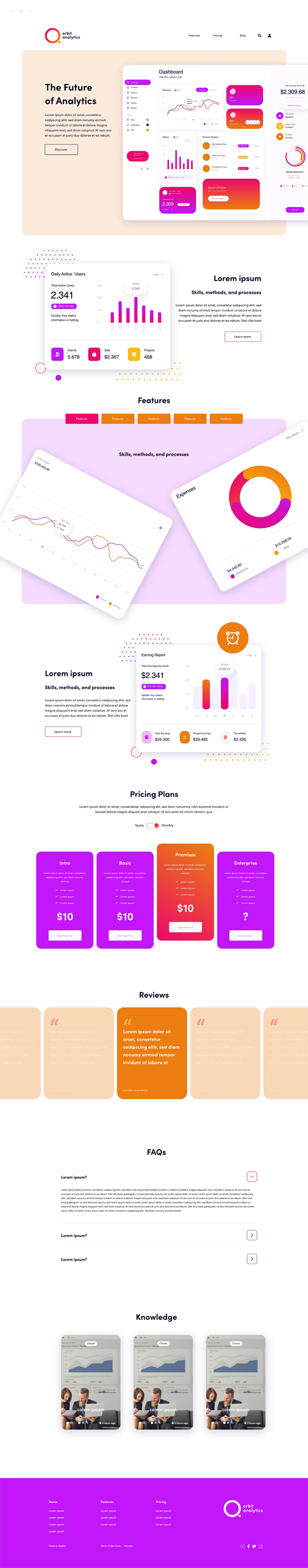
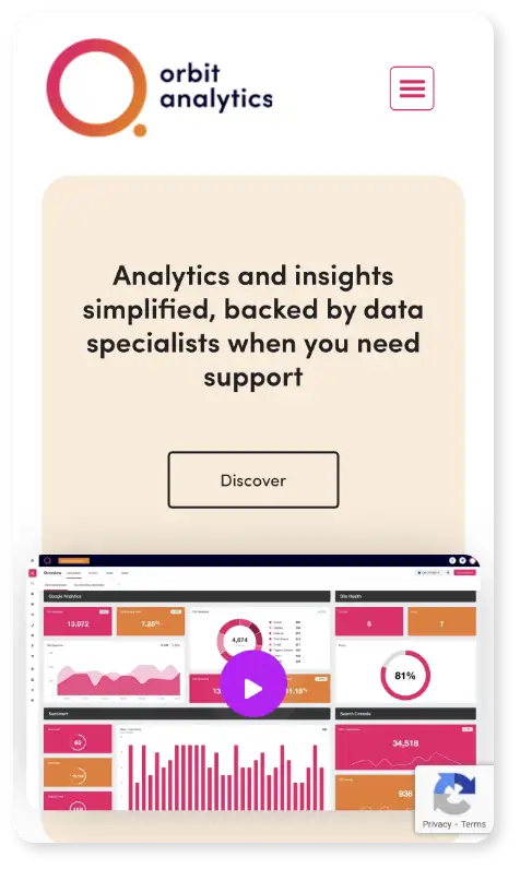
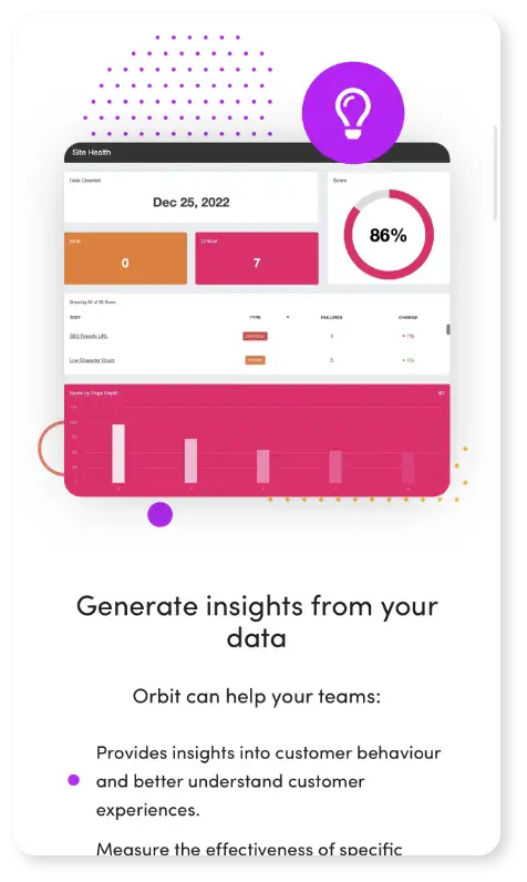
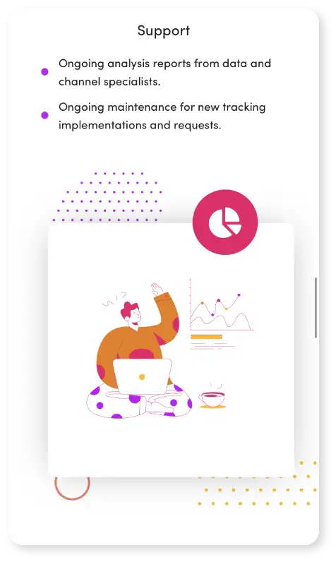
Orbit Analytics’ website offers an exceptional user experience (UX) and a visually captivating user interface (UI). The UX design focuses on creating a seamless and intuitive journey for users as they navigate the platform. The products dashboard, meticulously crafted, takes centre stage, providing a well-organised and user-friendly layout that simplifies data interaction.
Client: Orbit Analytics Year: 2022 Deliverables: Creative Direction, Branding, UX, Web Development
We partnered with Orbit Analytics to create a brand and platform that makes data approachable, friendly, and fun. Centered around accessibility and ease of use, we crafted a modern brand identity featuring a clever orbit-inspired logo, soft typography, and a bold, vibrant colour palette that breaks from traditional analytics aesthetics.
From visual identity to platform UX, every element was designed to reduce complexity and encourage user engagement. The website and dashboard offer a clean, intuitive experience, simplifying the way users interact with data while reinforcing Orbit’s mission: to bring people and data together through design that feels human.