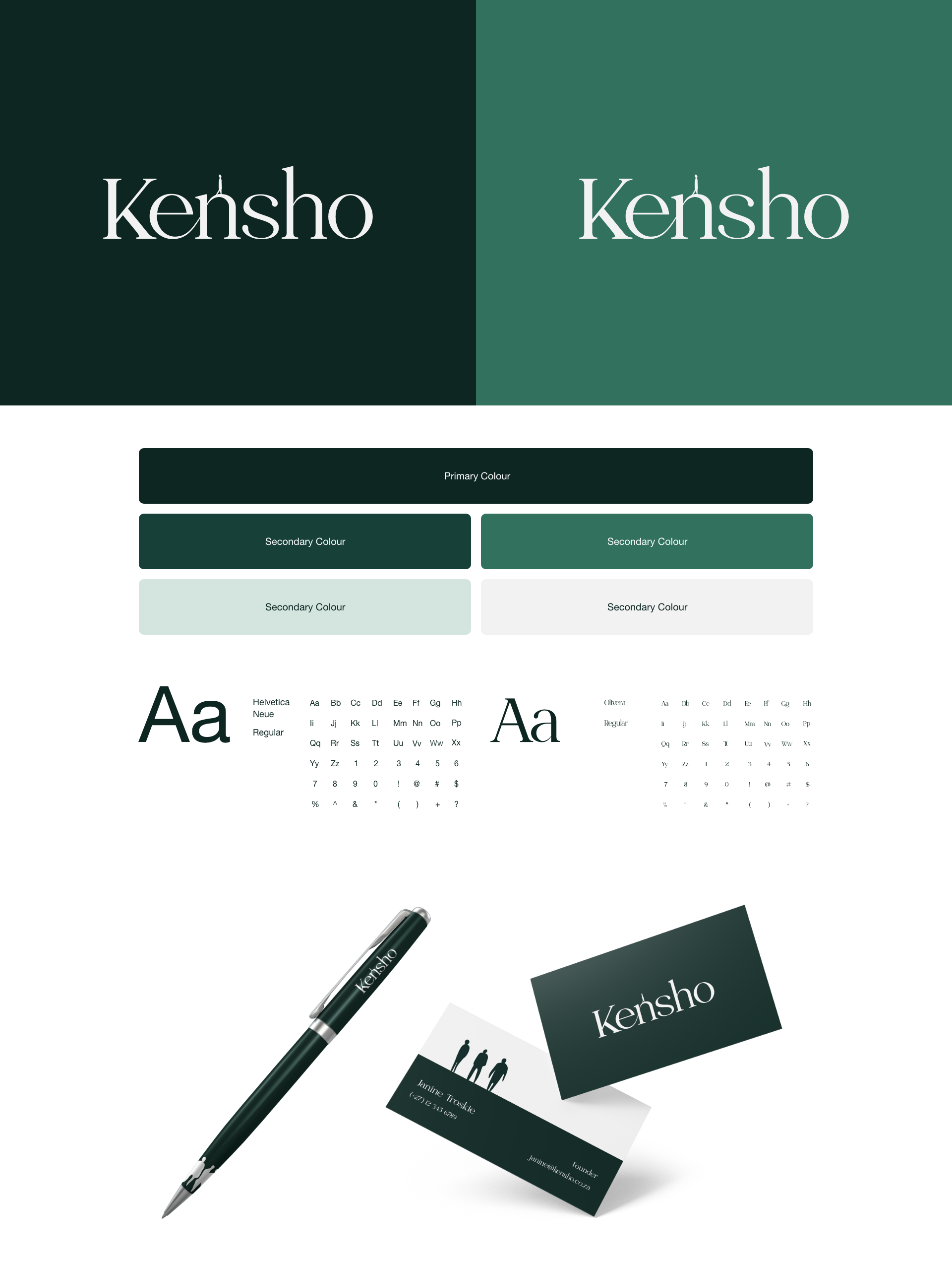
Our task was to develop a compelling brand identity for a client transitioning from corporate life to hypnotherapy, while addressing the uncertainties surrounding the practice caused by prevailing myths. We aimed to educate
and inform, emphasising hypnotherapy as a safe and beneficial method for self-discovery.
Through research, we discovered that hypnotherapy creates a deep state of relaxation and heightened awareness, allowing clients to quiet internal noise, confront trauma, and reshape their narratives. We crafted an emotive brand identity, symbolising the client’s practice as a “safe passage” to personal enlightenment, capturing the transformative moment of Kensho.
By incorporating elements of tranquillity, self-discovery, and empowerment, we positioned the client as a trusted expert. Our goal was to dispel myths, educate individuals about hypnotherapy’s true nature, and unlock their subconscious paths to quiddity—their essential truth.
We utilised a natural green colour palette in the brand identity to evoke grounding and represent the natural process of self-discovery. Green symbolises nature, growth, and harmony, aligning with the understanding of oneself and conveying tranquillity, balance, and renewal. By incorporating nature imagery and connecting it to the concept of Kensho, meaning “seeing nature,” we deepened the understanding of the brand identity and its relationship to the journey of self-discovery.
In addition to the colour palette, we carefully selected a script serif font to enhance the brand identity. The font choice evoked a sense of safe passages, journeys encompassing highs and lows, and the essence of nature. Its graceful and flowing aesthetic mirrored the transformative journey, while conveying elegance, warmth, and familiarity.
By integrating the script serif font with the visual elements, we created a cohesive design language that reinforced the brand’s message of safe passages, exploration, and connection with nature.

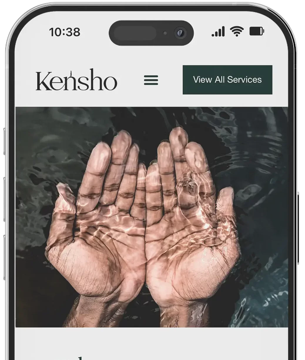
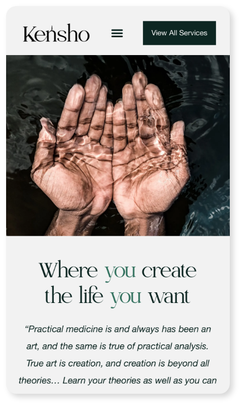
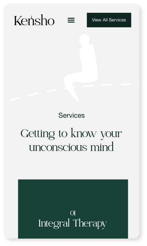
The UX and UI of the Kensho website were thoughtfully designed to provide a simple and clean user experience. We aimed to create a visually appealing interface that evoked the feeling of an open mind and encouraged exploration. To achieve this, we embraced ample white space, allowing the content to breathe and fostering a sense of clarity and focus.
Throughout the website, we strategically incorporated icons of people and dotted lines to symbolise personal journeys. These visual elements added depth and meaning to the user experience, reinforcing the message of self-discovery and individual transformation. The icons of people represented the clients themselves, while the dotted lines suggested the paths they would embark upon during their transformative journeys.

Client: Orbit Analytics
Year: 2022
Deliverables: Creative Direction, Branding, UX, Web Development
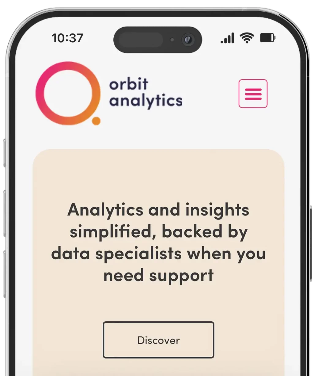
We partnered with Orbit Analytics to create a brand and platform that makes data approachable, friendly, and fun. Centered around accessibility and ease of use, we crafted a modern brand identity featuring a clever orbit-inspired logo, soft typography, and a bold, vibrant colour palette that breaks from traditional analytics aesthetics.
From visual identity to platform UX, every element was designed to reduce complexity and encourage user engagement. The website and dashboard offer a clean, intuitive experience, simplifying the way users interact with data while reinforcing Orbit’s mission: to bring people and data together through design that feels human.
