With eta’s decision to upgrade its website, the brand found itself in an exciting position of growth. This presented us with a valuable opportunity to revitalise the brand’s corporate identity and propel it into a modern, youthful, professional, and connected space.
By embracing this transformation, eta would become more relatable to its Gen Z target audience, forging a deeper connection with them.
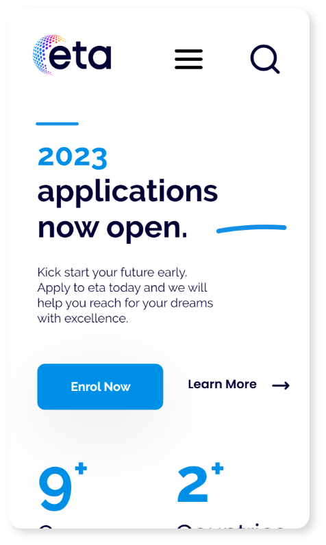
The centrepiece of the revamped CI was a modernised globe, crafted entirely out of interconnected circles.
This globe symbolised the brand’s global interconnectedness, emphasising eta’s commitment to staying connected and embracing the ever-changing world. The use of circles as building blocks represented unity, inclusivity, and the seamless integration of diverse ideas and perspectives.
This imagery resonated strongly with Gen Z, who prioritised connectedness and valued a global mindset.
A comprehensive update to eta’s Corporate Identity (CI) was essential. One key aspect of this update was the incorporation of a vibrant colour palette that reflected the brand’s energetic and playful nature. By utilising a range of bright, playful colours, we created an engaging visual experience that instantly captured the attention and enthusiasm of both Gen Z and their parents.
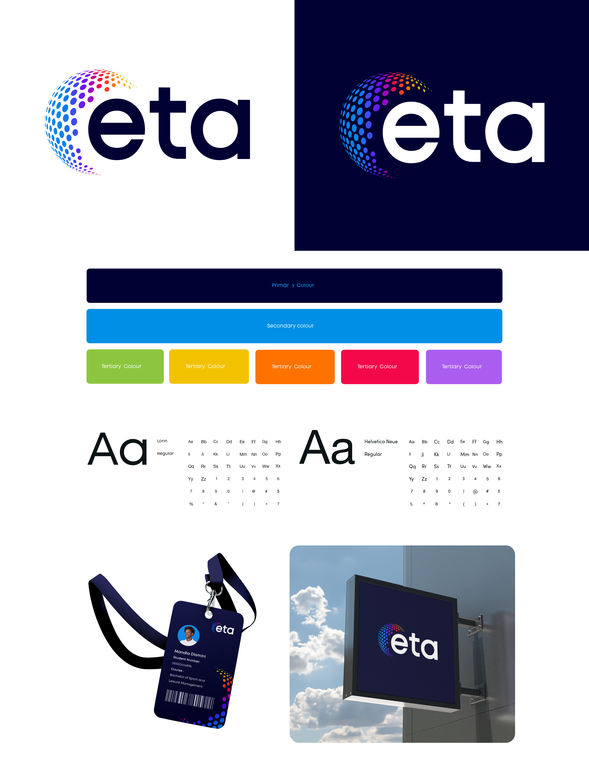
By implementing these strategic design choices, eta’s updated CI effectively communicated its message to both Gen Z and their parents. It conveyed the brand’s dedication to embracing the digital era and evolving alongside it, ensuring that children remained connected to their future careers and dreams. Through a modern and visually appealing CI, eta positioned itself as a reliable partner, assuring parents that their children’s aspirations were in safe hands.
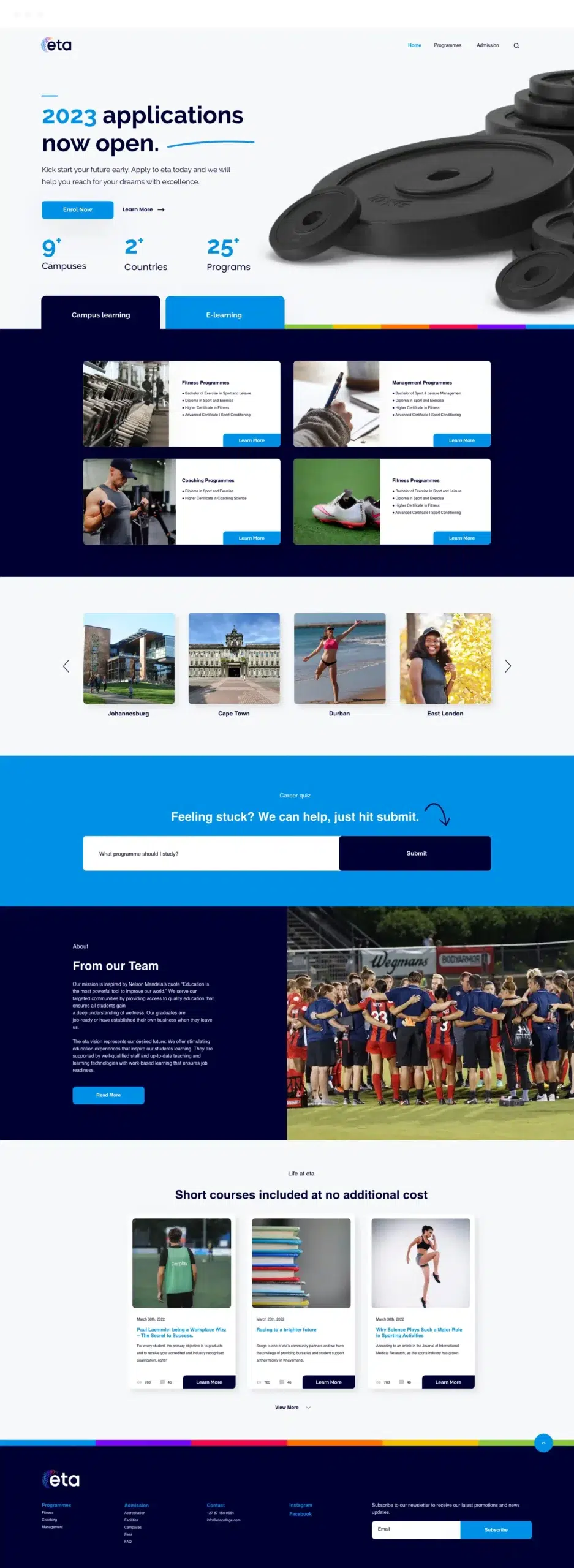
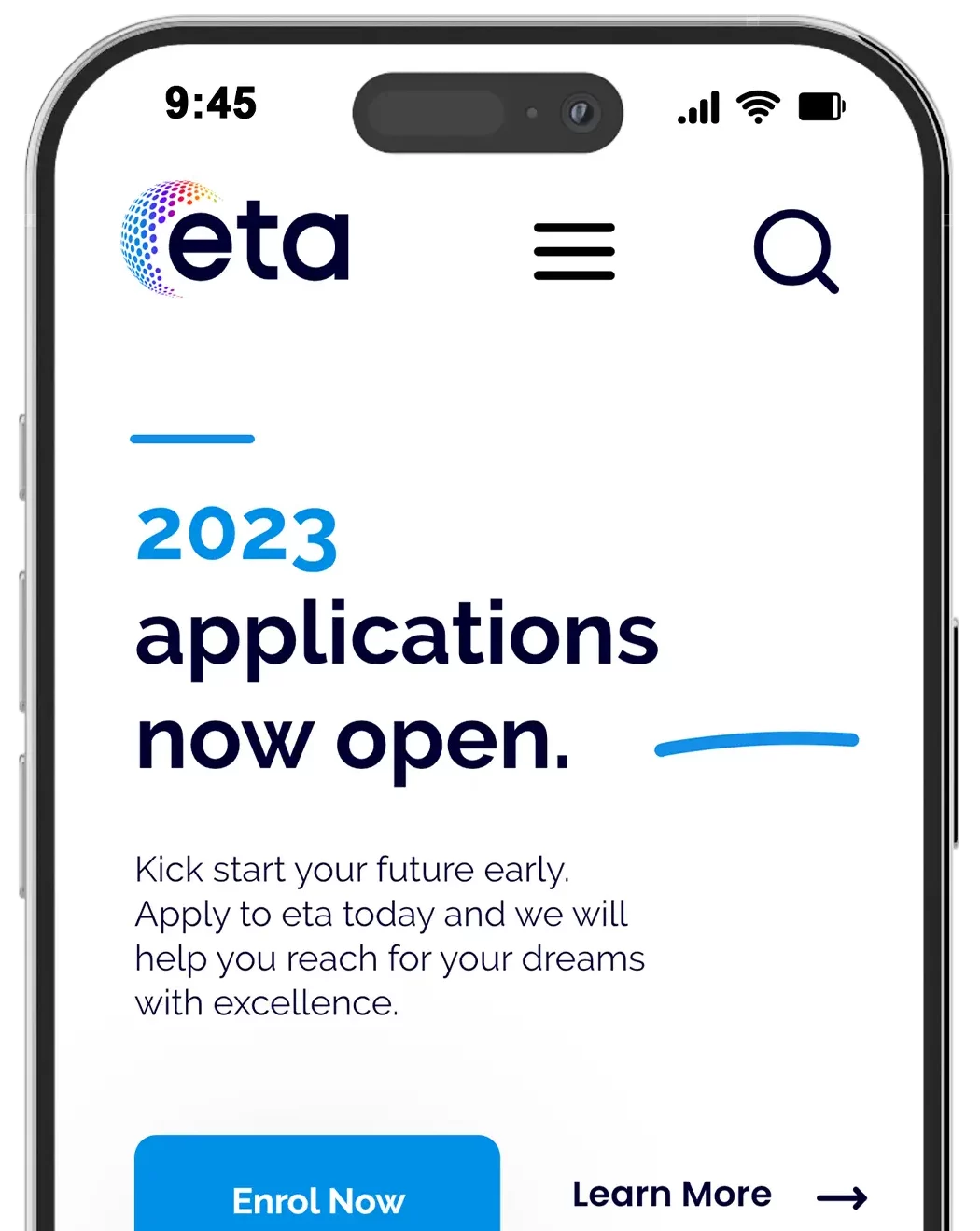
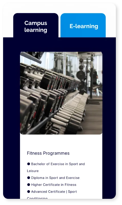
The new website design for eta featured a modern, minimalist aesthetic, creating a fun and engaging user experience. Inspired by e-commerce design, the site offered a visually stimulating environment with bright colours and intuitive navigation. Incorporating interactive elements, such as ‘product’ gallery of their courses, it provided a delightful and user-friendly interface for Gen Z users, despite not being an e-commerce platform. The result was a modern, connected website that kept users engaged and reflected eta’s ethos.

Client: Orbit Analytics
Year: 2022
Deliverables: Creative Direction, Branding, UX, Web Development
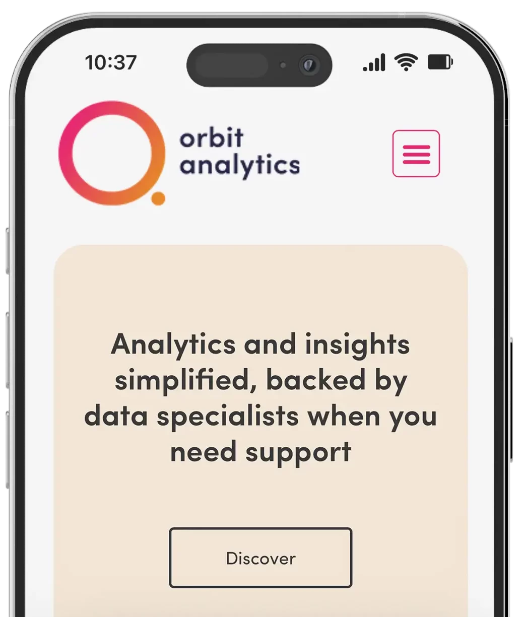
We partnered with Orbit Analytics to create a brand and platform that makes data approachable, friendly, and fun. Centered around accessibility and ease of use, we crafted a modern brand identity featuring a clever orbit-inspired logo, soft typography, and a bold, vibrant colour palette that breaks from traditional analytics aesthetics.
From visual identity to platform UX, every element was designed to reduce complexity and encourage user engagement. The website and dashboard offer a clean, intuitive experience, simplifying the way users interact with data while reinforcing Orbit’s mission: to bring people and data together through design that feels human.
