With erNavigator’s decision to upgrade its website, the brand found itself in a unique position of growth. We had the opportunity to refresh the brand’s corporate identity and push the brand into a forward-thinking, modern, and professional space, appealing to both its local and international audiences.
However, because the brand had already established its roots in the minds of its target audiences, our objective was to update erNavigator’s corporate identity in a way that remained true to its original DNA. Our challenge was to evolve the brand instead of reinventing it.
To achieve this, we carefully considered the visual elements that would define erNavigator’s refreshed identity. We chose to utilise tones of blue to evoke a sense of trust, reliability, and professionalism. Blue, as a universally recognised colour, helped anchor the brand’s image and resonated with both local and international audiences.
Additionally, we strategically incorporated an accent of orange to add vibrancy, energy, and a touch of excitement to the brand. This contrasting colour created visual interest and provided a subtle nod to erNavigator’s ambition and innovation.
In terms of typography, we used a modern and spacious typeface that exuded professionalism and clarity. This choice reflected the brand’s commitment to staying ahead of the curve and embracing a contemporary aesthetic.
To maintain a connection with erNavigator’s previous identity, we introduced a special arrow treatment on the ‘r’ in the brand name.
This unique arrow symbolised navigation, representing erNavigator’s role as a guide and facilitator in Employee Relations. This subtle yet powerful design element served as a bridge between the brand’s heritage and its renewed vision, creating a sense of familiarity while signalling progress.
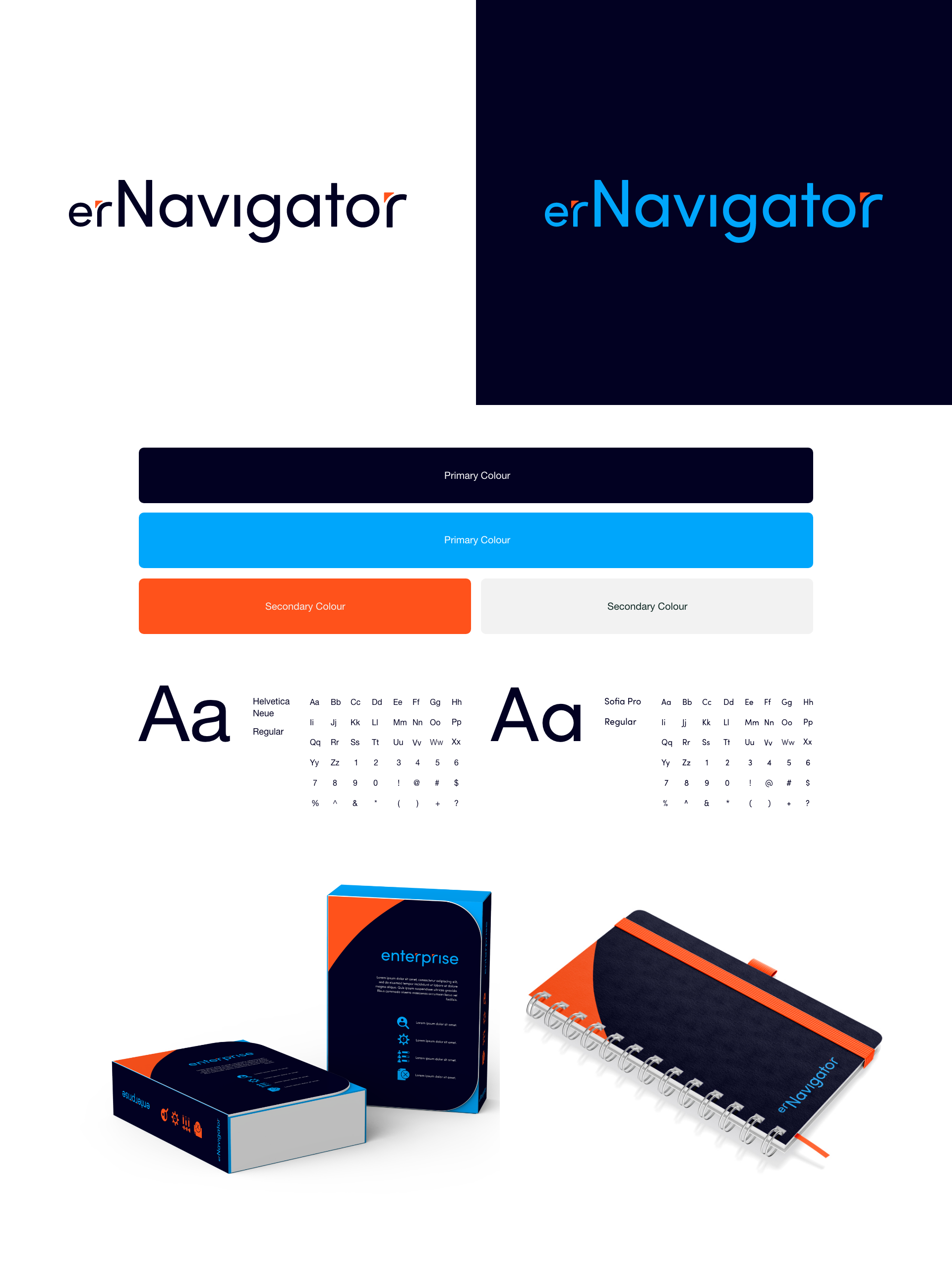

Applying erNavigator’s brand identity to their software products, Pro and Exterprise, we ensured a cohesive and consistent visual experience.
By incorporating the brand’s colours, design elements, and typography, we established a strong connection between the software products and the overall brand. The minimalist and modern approach of the brand’s corporate identity translated into intuitive and user-friendly interfaces for Pro and Exterprise. This alignment reinforces the brand’s commitment to professionalism, innovation, and user-centric design, enhancing the overall brand experience for erNavigator’s customers.
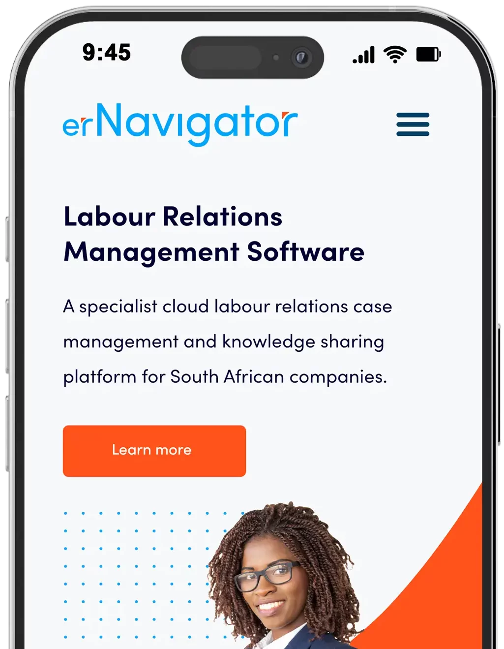
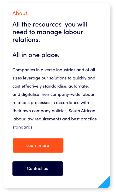
In the development of erNavigator’s new website, we found inspiration from the dynamic and ever-evolving tech space. Our primary focus was to create a user experience (UX) that embodied a minimalist approach while delivering an engaging and memorable user interface (UI) design with interesting mechanics.
We strategically incorporated subtle animations and micro-interactions throughout the website. These delightful details enhanced the overall user experience, making interactions more intuitive and enjoyable. Whether it was a smooth transition between sections or a subtle hover effect, these elements worked together to engage users and leave a lasting impression.

Client: Orbit Analytics
Year: 2022
Deliverables: Creative Direction, Branding, UX, Web Development
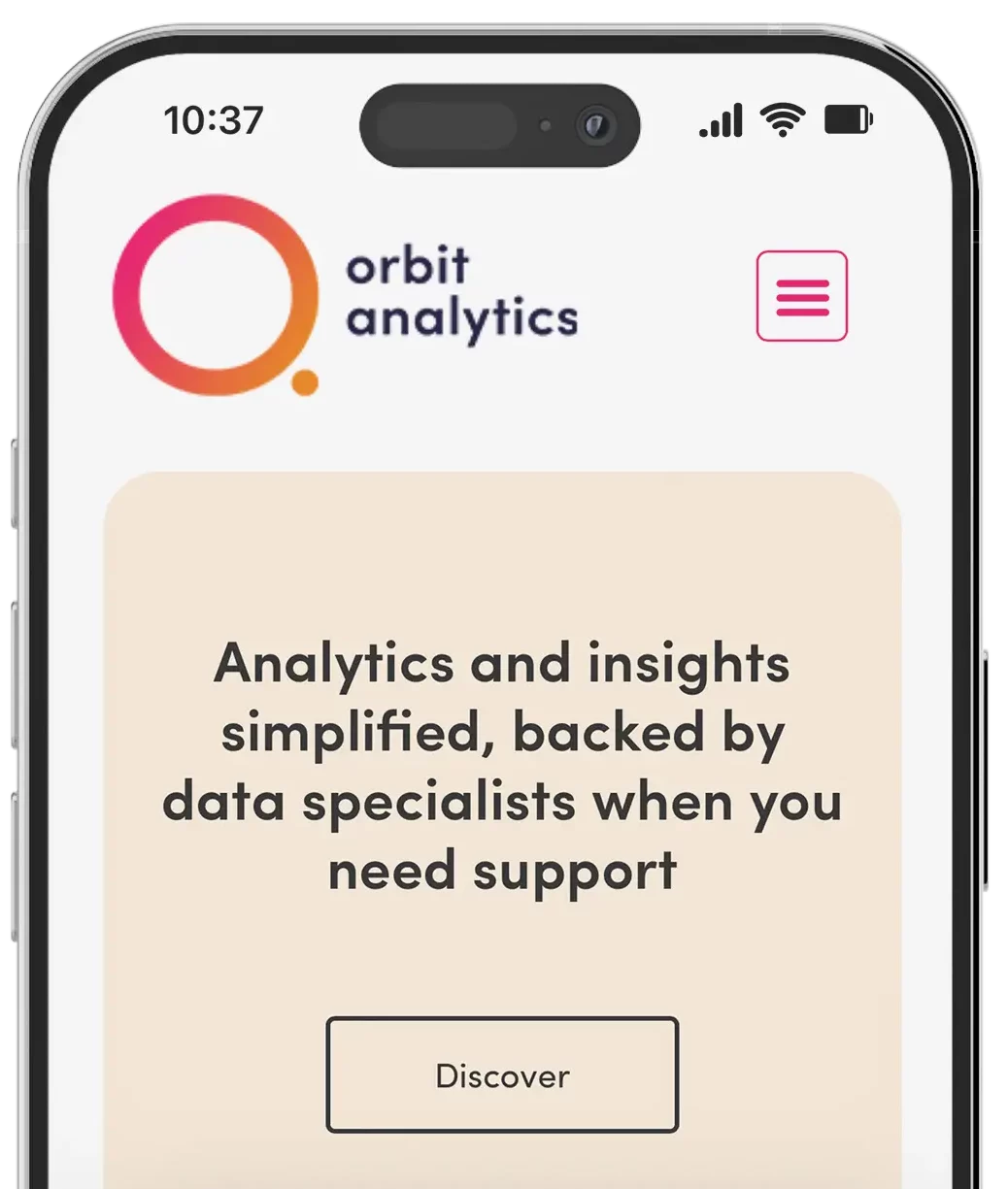
We partnered with Orbit Analytics to create a brand and platform that makes data approachable, friendly, and fun. Centered around accessibility and ease of use, we crafted a modern brand identity featuring a clever orbit-inspired logo, soft typography, and a bold, vibrant colour palette that breaks from traditional analytics aesthetics.
From visual identity to platform UX, every element was designed to reduce complexity and encourage user engagement. The website and dashboard offer a clean, intuitive experience, simplifying the way users interact with data while reinforcing Orbit’s mission: to bring people and data together through design that feels human.
